Our
Planet Earth From Space:
What do the symbols mean?
Active Volcanoes Active
volcanoes are shown as brown triangles, and erupting volcanos are shown in red.
The name of the volcano is printed next to the symbol in orange.
It is not unusual to see quake activity next to a volcano. Inside the triangles fires may be observed, which are lava flows.
Scale of volcanic acitivities: Vulcano ist restless; Eruption is possible.
(Volcano Alert Level 1) Volcano is erupting or eruptions are eminent.
(Volcano Alert Level 2-4) Significant eruptions are underway, or explosive eruptions are expected at any time. (Volcano Alert Level 5).
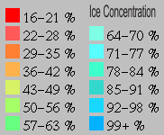
Sea Ice The extent of the Arctic ice field can be observed on the large North Pole map. That map can be opened by clicking on the Polar region.
If polar bear Knut's cousins can still tread safely on ice and in which regions their habitats are threatened by melting pack ice, can be gauged with the help of the color scale on the right.
The origin of the sea ice data is a satellite based passive microwave sensor.
The Polar Ice Team of NOAA uses a NASA formula to derive their measurements. The formula works by comparing the reflective properties of the various types of ice. Strong winds and heavy rains can falsify the data.
According to Russ Page (of the Anchorage WSFO) this happened for instance on 8 January 1997, when heavy 60 knot winds pounded the Bering Sea. In summer, sometimes puddles of water on the ice can lead to underestimating the ice thickness.
Climate Change Index
(Authors note: it is not my aim to propagate and validate here the fashionable theory of the season,
but I'm trying with the most simple methods to test the climate change theory, being a sceptic myself.)
(Image 1)The display on the left is visible on almost every map of this website. The current average global temperature is calculated from averaging the temperatures of approx. 130 weather stations. The data for this are from http://weather.noaa.gov/.
The Climate Change Index (+1.6° Celsius) is calculated from the deviation of the longterm average temperature of the 130 weather stations. It is thought that even though this is only a small random sample of global weather stations, it will give a general idea of global temperature trends.
(Image 2 ) We all have heard that supposedly the glaciers in Greenland are melting, because of global warming. Is that true? Here we see the temperature at Thule Airforce Base in Greenland on the 2. Sept. 2007, it is 3°Celsius. There is a second set of figures, the climate change indicator: +5.3. 5.3° Celsius was on September 2nd the temperature deviation from the norm. The norm is the "many years average" for September for Thule. As you can see here, the average September temperature in Thule between the years 1946 and 1990 was -1.8° Celsius.
Then you ask, why does the deviation from the norm not show this: "+4.8"
(as -1.8°Celsius to 3°Celsius equal +4.8°Celsius) ?
(Image 3 )The picture on the left shows the temperature at 11 GMT the day before. It was 4°C and the climate change indicator shows a deviation which is to be expected: (as -1.8°Celsius to 4 °Celsius equals +5.8°Celsius).
The reason for the differing values is, that the fluctuating daily temperatures are recorded every hour and the running average is calculated. The running average is then compared to the monthly average, which then is displayed as the climate change indicator.
Like this we always get a fairly accurate approximation of the change from the monthly average. However, as the part month averages are compared to the whole monthly average, it does mean that the climate change values get more accurate towards the end of the month. At the beginning of the month there can be strong fluctuations.
From the 1st to the 30th of September for instance, we expect a decreasing temperature in the northern hemisphere, which means that the value of the climate change indicator should decrease until the end of the month. The value will be exactly correct on the 30. September at midnight, for the place indicated. The results before then are neither mathematically nor climatologically quite correct, but it is hoped that they can help to detect temperature trends.
(Image 4) There can also be instances when the climate change indicator shows negative values (global cooling). In any case, when the temperature deviation from the norm is more than 2° Celsius positive or negative, then the fontsize increases and the color changes to indicate hot or cold spots. The hot-/coldspots are highlighted only from the second day of a new month, to have a minimum sample of 24 hours.
To show that my Climate Change Index is not a completely without value, I give a few examples of its merit:
COMPARISON WITH OFFICIAL CLIMATE CHANGE DATA "The global average air temperature near the Earth's surface rose 0.74 ± 0.18 °C (1.33 ± 0.32 °F) during the last 100 years." source: http://en.wikipedia.org/wiki/Global_warming
This measurement was arrived at in the report of the IPCC, using error corrected data of tens of thousands of weather stations over 100 years.
For comparison, here are the latest available full month data from my calculations and sampling of 130 stations. (Older data are archived in DivX movie format and can be downloaded from here: http://stage6.divx.com/Climate-Change). My results show a temperature rise of +0.71 to +0.73°C.
The difference to the official value of 0.74° Celsius
is 1% to 3%, a mean difference of 2%.
Update intervall: every 60 minutes
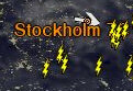
European Lightning data Lightning strikes of the past 20 minutes are shown as lightning bolts. For instance, if the map has a time stamp of 16:05 GMT, then the lightning data are from 15:40 - 16:00 GMT. This is sufficient to give a general overview of currently active thunderstorms. A total count of all registered lightning strikes within the past 60 minutes is given at the top of the European map(s), below the copyright notice.
More up-to-date data, accurate to within 60 seconds, can be found at the website of the Blitzortung community at [http://blitzortung.org]. On their website you will find more detailed information, cool Yahoo gadgets to warn you of nearing thunderstorms and KML files to load into your Google Earth.
The lightning data must not be used to make decisions on the protection of lives or property, the data is presented only for the purpose of education and entertainment.
Update interval
all: every 20 minutes
Earthquake
Events (Audio warning system) Three
different data sources are used to create this view to provide an unique
picture of earthquakes on Earth. The data are refreshed every 20 minutes.
Yellow circles with a number next to them show earthquakes.
The size of
the circles corresponds to the strength of the Quake.
Quakes
not older than 2 hours are now shown as a crosshair in either reddish
(coral) EMSC or green USGS color. This helps to locate the spoken quake announcements. It also
gives a quick overview over the most recent earthquakes.
The Audio
Warning System consists of sound output announcing the seismic events
of the last 2 hours which exceeded a magnitude of 6 on the Richter scale.
Data Source 1:http://neic.usgs.gov/neis/finger/
Quakes sourced
from US "Earthquake Early Alerting Service" are displayed
on the map until Midnight GMT (UTC) with the date and time of occurence.
An earthquake analyst sights the data and interprets them according
to various criteria.
Earthquakes of magnitude 5 and greater are displayed with the name of
the location.
On
an immediate basis, all "Earthquake Early Alerting Service"
alarm events are displayed. At a minimum, this will include most earthquakes in the contiguous United States, Hawaii, and the more
populated areas of Alaska of magnitude 4.5 or greater, most other earthquakes
in the United States of magnitude 5.5 or greater, and most foreign earthquakes
of magnitude 6.5 or greater. In practice, many foreign earthquakes smaller
than a magnitude of 6.5 will also be provided on an immediate basis.
Data
Source 2: http://earthquake.usgs.gov/recenteqsww Color
code green USGS. This is the list
of recent Earthquakes Worldwide of the past 24 hours from the United
States Geological Service. The list includes Worldwide earthquakes with
M4.0+ located by USGS and Contributing Agencies (Earthquakes with M2.5+
within the United States and adjacent areas.) . The quakes are not interpreted
by an analyst (aftershocks for example are not removed).
Data
Source 3: http://www.emsc-csem.org Color
code (coral) EMSC. Because data sources
1 & 2 ignore most quakes below magnitude 4.5 or 4.0 outside of the
US, I have added information from the European-Mediterranean Seismological
Centre. This
information comes from several individual seismological networks in
the Euro-Med region. The quakes are not interpreted by an analyst (aftershocks
for example are not removed). Shown are the last 20 quakes of larger
than mag 2.4.
Ship locations
and water temperatures The
current position of selected ships is shown with an icon of the ship and
its name. The water temperature (where available) is also shown.
A detailed catalogue of ships shown
is available on this page [click].
The position of the ships is updated every 60 minutes, and shown are vessels
which have reported their coordinates within the last 48 hours.
When a ship disappears off the map it is no cause for alarm, it just means
that its position was not reported for more than 48 hours.
Ship location and temperature data courtesy of sailwx.info
(used by permission). Go to [this
page] for a complete map of ship locations worldwide.
Update interval
all: every 60 minutes
Fires Shown
are burning fires from the last 24 hours from data of the Rapid Response
System of MODIS satellites (Aqua, Terra).
The size of the fire on the map is not a representation of its actual size,
but of the temperature at which it burns.
The
smallest fire of any description (forest- bush- slash and burn fires or
burning structures like houses) which can be detected is 50m² in size.
Cloud
cover will obscure active fire detections.
To the best of my knowledge the system can't distinguish volcanic activity
like lava flow from other fires.
The data from the Rapid Response System of the MODIS satellite system is
filtered on my website according to these criteria:
1. the brightest fires over 370 Kelvin are displayed only when the "confidence" is 100.
Scale:
fire brightness in Kelvin >310: : >320: >330: >340: >350: >360: >370:
Global Fire Index: number of all
detected fires in the last 24 hours.
Question:
How fast is the display of fire data on your website?
It
takes 3-4 hours after the satellite has passed over the fire until the data
is processed at the University of Maryland. My computers fetch the freshest
data every three hours from there to produce the graphic display for the
website. It takes 15 minutes after this until you can see it on your computer
screen.
Answer:
The newest fires on the screen are 3.5 to 4.5 hours old but it can take
up to 7.5 hours.
The
Rapid Response System of MODIS
is a a collaboration between the NASA Goddard Space Flight Centre (GSFC)
and the University of Maryland (UMD).
The
data updates for all continents happen every 3 hours, depending on the
overhead passes of the satellite.
Wind direction The
current (within the last hour) direction of the wind is shown by an arrow.
I think this is a feature which has been lacking for a long time, because
this information makes it possible to make informed guesses about the coming
weather.
Weather forecasts and climatological information for selected cities are
supplied by National Meteorological & Hydrological Services (NMHSs)
worldwide. Please visit the credits page for a full list of participating
stations.
Displays of the International
Spacestation,
the Space-Shuttle and the Hubble Telescope The
yellow trail on the International Space Station and the Hubble Telescope
shows the last 10 minutes of flight. The Yellow Circle around the Space
Station is the horizon line, i.e. if you are within the circle you should
be able to see the station from the ground in theory.
If a Space Shuttle is in orbit it will be displayed. If its mission does
not involve going to the ISS, then the satellite which it is going to
meet will be displayed. If a Space Shuttle is launching a satellite, then
the satellite it is launching will be shown when deployed.
The position of all satellites is updated every 20 minutes. (The TLE [Two
Line Element] data from which the position is computed is downloaded in
longer time intervals, but in practice the accuracy is sufficient. Keppler
TLE's have to be updated to compensate for the cummulative effects of
moon tides, slight navigational manoeuvres and solar wind on the orbits.
And of course to receive up-to-date information on new satellite or Space
Shuttle launches.)
The
view "View from International Spacestation" shows more detail:
displayed here are also the presently docked salvage boats and supply
rockets (and the official designation of the ISS). ISS is in a low earth
orbit at 400 km / 248miles altitude. All Orbits are shown to scale.
For Satellite Watchers and Space buffs (functional demonstration):
In the "View From The ISS" and the "Just Flying Around"
screensavers the following handy satellite look-up tool is included.
Enter for example the name of the Modules you see docked and find out
their launch date and purpose. It is not necessary to choose the Satellite
Purpose. Please be as precise as possible when entering a satellite
name for searching. The entry "Soyuz" would for example return
93 hits and it will take much longer to get a response from the NASA
spacecraft catalogue..
Clouds The
latest cloud data are compiled by
Hari Nair from GOES, METEOSAT, and GMS satellite imagery. The thumbnail
on the left gives an idea of the format. The image is resampled to a higher
resolution to minimize the pixelation on the Planetary close-ups.
Data from: GOES, METEOSAT, and GMS.
Update interval:
every 2 hours
Global
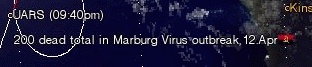
Incidents Shown
are casualties of natural disasters, such as earthquakes, fires, disease,
avalanches and floods.
The number of casualties is shown, the cause of death, the date and the
flag of the nationality of the victims.
Victims of war, strife and accidents are no longer covered.
Exceptional happenstances will prove the exception, however.
Data from: public news sources,
broadcasts, headlines
Update interval: 24hours.
Tropical
Storms
Tropical
storms are shown according to their severity with their respective
symbols.
A
tropical depression (T.D.):
A
tropical storm (T.S.):
A
hurricane, cyclone or typhoon (Hur., Cyc.):
The name and speed of the storm is shown in Green. Where and when the storm
started is shown in red next to a small circle. The path the storm has already
travelled is shown as a solid red line. The predicted path of the storm
is shown as a dotted line, and when the storm is expected to reach the predicted
location is shown. In the "North America" views of this website
the speed is shown in miles per hour, instead of in kilometers.
The tropical cyclone data presented here are intended to convey only general
information on current storms and must not be used to make life or death
decisions or decisions relating to the protection of property: the data
may not be accurate. If you are in the path of a storm you should be listening
to official information sources. The data presented at this site have
no official status and should not be used for emergency response decision-making
under any circumstances.
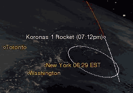
Visible Satellites Visible
satellite data depend on two factors: observer location and time of day.
During the day there are no visible satellites, because the sun is too
bright.
We see here the Koronas
1 Rocket travelling over the Boston area on its way towards the North
from a Southerly direction.
The length of the white tail shows where the satellite has been in the
past 10 minutes, whilst the red tail shows where the craft will be travelling.
The small white dot indicates where the spacecraft was at the precise
time shown in the right hand corner in green.
The area in which the satellite is visible is indicated by the white circle
on the ground. The lower the altitude of the satellite, the smaller the
circle will be. The altitude of the satellites shown is correct. There
are satellites which orbit the Earth at lower than 300 kilometers/186
miles whereas some meteorological and communications satellites orbit
at altitudes of 40000 km /25000 miles.
For North America:
The brackets display in MST (Mountain Standard Time)
when the satellite will be visible in Denver, Colorado.
For Europe &
Middle East: The brackets display in GMT (Greenwich Mean Time)
when the satellite will be visible in London, England.
The views generated
all show only the brightest satellites of magnitude: +3.5 and lower. Magnitude
is is a measure of the brightness of a celestial object. The lower the
value, the brighter the object. The limit of the human eye is Magnitude
+6 to +7, which means the Earth satellites presently shown are about 3
orders of Magnitude brighter than the dimmest objects in Space.
Research Stations Scientific
research stations are shown as yellow huts. By hoovering with your
mouse over them you can read the country and name of the station.
Clicking on the hut brings you to the homepage of the research station
(if exists).
Icebergs There
are two different displays for icebergs:
Icebergs above 62° Latitude South are shown as large icons, with the
name of the iceberg printed in red. The second line shows the position of
the iceberg in degrees. The actual position of the iceberg is the small
red dot in the middle. The size of the icon does not represent the size
of the iceberg.
Icebergs on the non-Antarctic views are smaller (to fit within the scale
of other icons). Because the red font is harder to read in the smaller version
the name of the berg is now in white (more legible).
Icebergs
found below
62° Latitude South are simply shown as a green square. The reason
is that there are simply too many of them to use a larger icon.
The data for the Iceberg Quikscat Display of large icebergs
is from the Scatterometer Climate Record Pathfinder (Center for Remote
Sensing, BYU). They use satellite imagery to detect icebergs.
Sublunar Point
The wandering Moon image, which is present on most maps of this website, indicates the position of the Moons gravity center on Earth (sublunar point), otherwise known as "tide-producing center". It also shows the current Moon phase.
Birdflu cases Birdflu
cases (infections with virus H5N1) both in birds and humans,
are shown by this symbol:
. Not
all known cases are shown, it's only intended to give a rough estimate of
the front of the disease.
 Shown
are casualties of natural disasters, such as earthquakes, fires, disease,
avalanches and floods.
Shown
are casualties of natural disasters, such as earthquakes, fires, disease,
avalanches and floods. There
are two different displays for icebergs:
There
are two different displays for icebergs: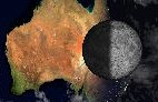
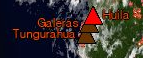 Active
volcanoes are shown as brown triangles, and erupting volcanos are shown in red.
The name of the volcano is printed next to the symbol in orange.
Active
volcanoes are shown as brown triangles, and erupting volcanos are shown in red.
The name of the volcano is printed next to the symbol in orange.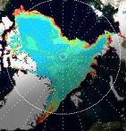
 The extent of the Arctic ice field can be observed on the large North Pole map. That map can be opened by clicking on the Polar region.
 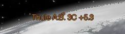 (Image 2 ) We all have heard that supposedly the glaciers in Greenland are melting, because of global warming. Is that true? Here we see the temperature at Thule Airforce Base in Greenland on the 2. Sept. 2007, it is 3°Celsius. There is a second set of figures, the climate change indicator: +5.3. 5.3° Celsius was on September 2nd the temperature deviation from the norm. The norm is the "many years average" for September for Thule. As you can see
  (Image 3 )The picture on the left shows the temperature at 11 GMT the day before. It was 4°C and the climate change indicator shows a deviation which is to be expected: (as -1.8°Celsius to 4 °Celsius equals +5.8°Celsius).
  (Image 4) There can also be instances when the climate change indicator shows negative values (global cooling). In any case, when the temperature deviation from the norm is more than 2° Celsius positive or negative, then the fontsize increases and the color changes to indicate hot or cold spots. The hot-/coldspots are highlighted only from the second day of a new month, to have a minimum sample of 24 hours.
 Lightning strikes of the past 20 minutes are shown as lightning bolts. For instance, if the map has a time stamp of 16:05 GMT, then the lightning data are from 15:40 - 16:00 GMT. This is sufficient to give a general overview of currently active thunderstorms. A total count of all registered lightning strikes within the past 60 minutes is given at the top of the European map(s), below the copyright notice.
 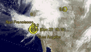 Three
different data sources are used to create this view to provide an unique
picture of earthquakes on Earth. The data are refreshed every 20 minutes.
Yellow circles with a number next to them show earthquakes.
Three
different data sources are used to create this view to provide an unique
picture of earthquakes on Earth. The data are refreshed every 20 minutes.
Yellow circles with a number next to them show earthquakes. Quakes
not older than 2 hours are now shown as a crosshair in either reddish
(coral) EMSC or green USGS color. This helps to locate the spoken quake announcements. It also
gives a quick overview over the most recent earthquakes.
Quakes
not older than 2 hours are now shown as a crosshair in either reddish
(coral) EMSC or green USGS color. This helps to locate the spoken quake announcements. It also
gives a quick overview over the most recent earthquakes. Color
code green USGS. This is the list
of recent Earthquakes Worldwide of the past 24 hours from the United
States Geological Service. The list includes Worldwide earthquakes with
M4.0+ located by USGS and Contributing Agencies (Earthquakes with M2.5+
within the United States and adjacent areas.) . The quakes are not interpreted
by an analyst (aftershocks for example are not removed).
Color
code green USGS. This is the list
of recent Earthquakes Worldwide of the past 24 hours from the United
States Geological Service. The list includes Worldwide earthquakes with
M4.0+ located by USGS and Contributing Agencies (Earthquakes with M2.5+
within the United States and adjacent areas.) . The quakes are not interpreted
by an analyst (aftershocks for example are not removed). The
current position of selected ships is shown with an icon of the ship and
its name. The water temperature (where available) is also shown.
The
current position of selected ships is shown with an icon of the ship and
its name. The water temperature (where available) is also shown. 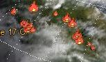 Shown
are burning fires from the last 24 hours from data of the Rapid Response
System of MODIS satellites (Aqua, Terra).
Shown
are burning fires from the last 24 hours from data of the Rapid Response
System of MODIS satellites (Aqua, Terra).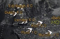 The
current (within the last hour) direction of the wind is shown by an arrow.
I think this is a feature which has been lacking for a long time, because
this information makes it possible to make informed guesses about the coming
weather.
The
current (within the last hour) direction of the wind is shown by an arrow.
I think this is a feature which has been lacking for a long time, because
this information makes it possible to make informed guesses about the coming
weather.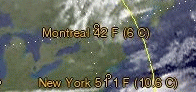 The
most recently available temperature reading (within one hour) is shown
next to a city marker.
The
most recently available temperature reading (within one hour) is shown
next to a city marker. 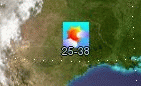 The
weather icons are
The
weather icons are 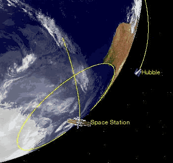 The
yellow trail on the International Space Station and the Hubble Telescope
shows the last 10 minutes of flight. The Yellow Circle around the Space
Station is the horizon line, i.e. if you are within the circle you should
be able to see the station from the ground in theory.
The
yellow trail on the International Space Station and the Hubble Telescope
shows the last 10 minutes of flight. The Yellow Circle around the Space
Station is the horizon line, i.e. if you are within the circle you should
be able to see the station from the ground in theory.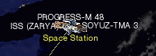 The
view "View from International Spacestation" shows more detail:
displayed here are also the presently docked salvage boats and supply
rockets (and the official designation of the ISS). ISS is in a low earth
orbit at 400 km / 248miles altitude. All Orbits are shown to scale.
The
view "View from International Spacestation" shows more detail:
displayed here are also the presently docked salvage boats and supply
rockets (and the official designation of the ISS). ISS is in a low earth
orbit at 400 km / 248miles altitude. All Orbits are shown to scale.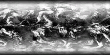 The
latest cloud data are compiled by
Hari Nair from GOES, METEOSAT, and GMS satellite imagery. The thumbnail
on the left gives an idea of the format. The image is resampled to a higher
resolution to minimize the pixelation on the Planetary close-ups.
The
latest cloud data are compiled by
Hari Nair from GOES, METEOSAT, and GMS satellite imagery. The thumbnail
on the left gives an idea of the format. The image is resampled to a higher
resolution to minimize the pixelation on the Planetary close-ups.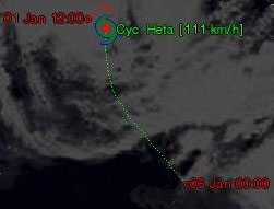
 Visible
satellite data depend on two factors: observer location and time of day.
During the day there are no visible satellites, because the sun is too
bright.
Visible
satellite data depend on two factors: observer location and time of day.
During the day there are no visible satellites, because the sun is too
bright. 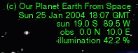 The small white dot indicates where the spacecraft was at the precise
time shown in the right hand corner in green.
The small white dot indicates where the spacecraft was at the precise
time shown in the right hand corner in green. Scientific
research stations are shown as yellow huts. By hoovering with your
mouse over them you can read the country and name of the station.
Clicking on the hut brings you to the homepage of the research station
(if exists).
Scientific
research stations are shown as yellow huts. By hoovering with your
mouse over them you can read the country and name of the station.
Clicking on the hut brings you to the homepage of the research station
(if exists).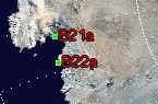 Icebergs
found below
62° Latitude South are simply shown as a green square. The reason
is that there are simply too many of them to use a larger icon.
Icebergs
found below
62° Latitude South are simply shown as a green square. The reason
is that there are simply too many of them to use a larger icon.